Tag: design

The art of ‘90s photo envelopes

While going through my library’s bevy of old staff and event photos, I encountered lots of what used to be commonplace but are now practically ancient artifacts: photo envelopes. Most of them were from the 1990s and early 2000s, which you can probably guess from the designs.

(See also: groovy ’70s library brochures.)

Tiles, trains, and all the magnetic feels

Two of my favorite activities to do with Mr. Two Years Old is play with his train tracks and Magna-Tiles. We started with a relatively small batch of both, but then he got big upgrades for Christmas and from his cousins as hand-me-downs, so recently we’ve been really going wild.

When we first got the tiles we tried to recreate the structure that was on the box. It took about five minutes before we abandoned any attempts to follow the instructions and just went rogue.

There’s the satisfaction in building something with your hands, and then there’s the satisfaction of feeling the magnetic snap as you piece together the different shapes into fantastical structures.

He really gets into the building part, sometimes for a surprisingly long time for a toddler, but then loses interest just as quickly. Whatever grand creation we’d just whipped into being usually gets summarily knocked down or abandoned for another activity.

Build it up, knock it down.

Recent Views (in my kitchen)

We’re finally redoing the original kitchen in our 1956 house. Once the old metal Youngstown cabinets were removed, I noticed this collision of patterns on the unfinished wall:

I also discovered some old-school miscellanea:

City roads turned into line drawings

Andrei Kashcha’s City Roads tool beautifully renders every road of any city in the world into a simple line drawing using OpenStreetMap.

I did my hometown of Madison (above), knowing its isthmus gives it a distinct look. I then did the city where I work and discovered that for some reason it includes a large chunk of the interstate that borders it:

(Via Kottke)

This is my backpack

Part of the This Is My series.

Thanks to the magic of email, I know that in March 2009 my mom asked if I wanted anything from REI. She had a coupon that was about to expire but didn’t need anything for herself.

REI is one of those stores I love in principle but don’t actually buy from, mostly due to the prices. So I jumped at that opportunity to get something I normally wouldn’t. I considered what I could use and landed on the CamelBak Blowfish Hydration backpack, pictured here over 10 years later in its usual hangout spot by the door:

(You might recognize the jacket next to it.)

It’s slim yet expandable, with just enough compartments, and padding in the back to make it breathable. In the picture it’s stuffed with library books, CDs, and my notebooks, with assorted pens, my sunglasses, and earbuds in the front pouch. It’s not super convenient for transporting my laptop, which I have to wedge in between the tapered zipper design, but it’s gotten the job done for a long time.

And in that time, it has accompanied me on every flight, hike, and trip I’ve taken, to every college and grad school class I attended, and darn near every workday I’ve logged. Somewhere along the way I stopped using the water pouch because it made everything in the main compartment a little damp and took up too much space.

It’s not available at REI anymore, so once the end of its useful life arrives I’ll have to find something else like it. I’ve tried satchels and messenger bags, but nothing beats the two-strapping reliability of a quality backpack.

This is my jacket

Part of the This Is My series.

If you have met me in the last 15 years, there’s a decent chance you have seen me in this orange jacket:

I acquired it in 2004 on a trip from Madison to Kansas City with a few people from my youth group to attend a conference. We stopped at a Salvation Army somewhere along the way, which is where I spotted it. Don’t remember how much it cost, but since I’ve worn it for darn near half the year every year since, I’d say it was a sound investment regardless.

It had the same appeal then as it does now: a bold orange color, accessible pockets, and the perfect thickness for use as a spring and autumn jacket—not too thick and not too thin.

Sometimes I wonder if it’s time to find another light jacket. It’s starting to fray now, having served me and previous owners well for who knows how long. Something more waterproof or muted might be a better look and practical move.

But by Jove, I’m sticking with it, because I stick with useful things to their bitter end. It’s my only play against planned obsolescence and conspicuous consumerism. Until I accidentally lose it or it disintegrates beyond repair, it’s staying on my coat rack. That’s the only way to honor such a reliable companion.

Circle of lives

Somewhere on the Internet I stumbled upon this print from the artist Nina Montenegro’s series Against Forgetting:

It struck a chord in me not only because I’ve been reading the tree-centric novel The Overstory, but also because six days ago I became a father. And I’ll tell ya, I know I’m barely a week into this, but there’s nothing like having a child to make you reconsider everything you think you know about time.

My favorite notetaking apps

C.J. Chilvers wrote about the pros and cons of popular notetaking tools. Out of the four he features—Apple Notes, Evernote, Ulysses, and Bear—I have used two previously, and none currently. So, having already examined my favored podcasts and newsletters, here’s a look at the tools I do use and why I use them.

Paper

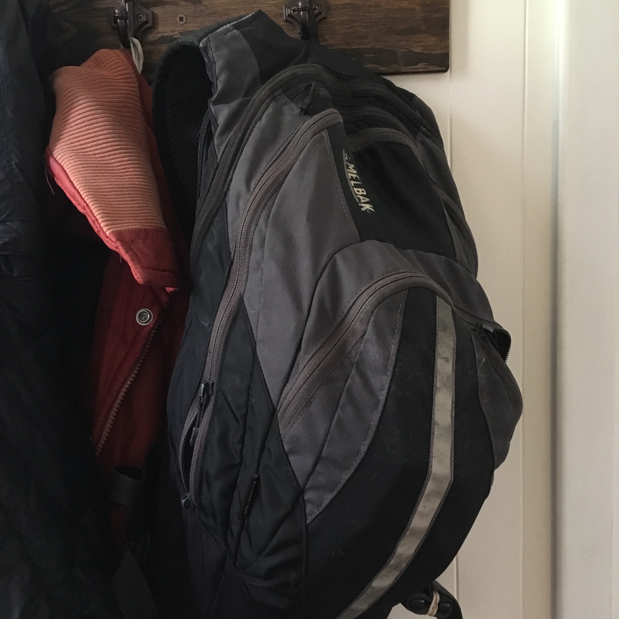
The once and future king of all notetaking apps. I keep a plain, pocket-sized Moleskine in my backpack for odds and ends, a larger journal as a daily diary and scrapbook (previously a Moleskine classic hardcover and currently a Zequenz 360), and a good ol’ composition notebook for my filmlog.

WorkFlowy

Dynamic, lightweight list-making with blessed few bells and whistles. Perfect for hierarchical thinking, tasks, and anything else you can put into a list. It’s built for marking tasks complete, but I use it mostly as an archive for reference, split between Work and Personal. Plus a To Do list at top for quick capture of tasks.

Simplenote

Good for taking quick notes in plain text. I often use it for first drafts of blog posts, taking book notes, and whatever else I need a basic text editor for. Helpful when trying to remove formatting from text you want to paste cleanly elsewhere—”text laundering” as I call it. Clean, simple, works well on the web and mobile.

Google Drive

For when Simplenote isn’t enough. Good for collaboration and as a document repository. Among other things my Logbook spreadsheet is there, as are lots of work-related docs, random files shared with my wife, my archive of book reviews, and my Book Notes doc filled with (at present) 121 single-spaced pages of notes and quotes from 108 books.

Apple Reminders

Used mostly for sharing shopping lists with my wife, because it’s easy to regenerate lists from completed items. Unfortunately it doesn’t sync well between devices without WiFi, which is a bummer when we’re out shopping.

Google Calendar

Google, don’t you ever get rid of Calendar. I mean it. Some former Google products had it coming, but you’re gonna ride or die with Gmail and Calendar, ya hear?

Dropbox

Essential for quick and easy file backup. Through referrals and other incentives over the years I’ve accumulated 5.63 GB in free storage on top of the 2 GB default. I’m using over 95% of it.

LEGO my DeLorean

Wait a minute, Doc. Are you telling me you built a time machine… out of LEGO?

While rearranging the apartment in advance of Baby, I was sorting our small games collection and stumbled upon the unopened LEGO Back to the Future set my dad got me a few years ago. I gotta say, it was super fun to put together:

I haven’t encountered LEGOs in years, maybe decades. Even a relatively small project like this one had several bags with hundreds of small pieces. But following the directions made it come together pretty quickly. Much respect to the engineers who create these designs.

Paper Only! No TVs

This sign is posted in the parking lot outside my work. Why “NO TV’s”? A while ago someone left an old TV next to what they thought was a dumpster for trash but is actually a dumpster for paper recycling. But only people who had seen the TV there before it got picked up will understand the odd specificity of the sign.

It’s still a great sign without that context, because paper is the far superior technology.

Päntsdrunk, baby box, Moomin, and Finland’s other official emojis

God bless Finland, my ancestral homeland. First, there’s the new book Pantsdrunk (Kalsarikanni): The Finnish Path to Relaxation (Drinking at Home Alone in your Underwear) by Miska Rantanen. From the publisher:

Danes have hygge. Swedes have lagom. But the Finnish secret to contentment is faster and easier—”kalsarikänni” or pantsdrunk—drinking at home, alone, in your underwear.

When it comes to happiness rankings, Finland always scores near the top. Many Finnish phenomena set the bar high: the best education system, gender equality, a flourishing welfare state, sisu or bull-headed pluck. Behind all of these accomplishments lies a Finnish ability to stay calm, healthy and content in a riptide of endless tasks and temptations. The ability comes from the practice of “kalsarikanni” translated as pantsdrunk.

Peel off your clothes down to your underwear. Place savory or sweet snacks within reach alongside your bed or sofa. Make sure your television remote control is nearby along with any and all devices to access social media. Open your preferred alcohol. Your journey toward inner strength, higher quality of life, and peace of mind has begun.

Second, Finland’s official Ministry of Foreign Affairs produced a set of 56 emojis to “explain some hard-to-describe Finnish emotions, Finnish words and customs.” I can and cannot believe these are real:

“pantsdrunk” personified:

kalsarikannit_m.png
kalsarikannit_f.png

The famous Baby Box:

baby_in_a_box.png

The Aurora Borealis:

auroraborealis.png

“Finnish Love”, which is so emo:

finnishlove.png

The concept of sisu:

sisu.png

The sauna:

sauna_m.png

And of course, the OG cell phone, the Nokia (which they call “Unbreakable”):

unbreakable.png

Download the app or the image files for more pantsdrunk-ing pleasure.

Denver Crush Walls

Got to visit Denver for the second time this year for a friend’s wedding. While there another Denver friend brought me on a walking tour of the Crush Walls urban art festival in the RiNo neighborhood, where we saw some really cool graffiti:

Know Wonder

I’m sad I missed the TEDx event this year at my alma mater, especially because of its great theme and logo:

tedxncc-knowwonder-concpet-final.jpg

OED can you see?

A used books and records store in my town just moved even closer to my place. Today I stopped by and saw a two-volume Oxford English Dictionary Compact Edition. It comes in a case and with its own magnifying glass, because they weren’t kidding when they called it compact:

I exercised enough self-control to pass on it, but one day…

Fly the L flag

On my way to a concert last night, I noticed the flag-like design of the Chicago L train platform and tracks when viewed from above:

Track, platform, and the space in between. “The space between” being, in essence, what public transportation is.

Make the interrobang banal‽

99% Invisible (a personal favorite podcast) just did a typically great short history of the interrobang and its fight for survival:

Today, the interrobang is just barely hanging in there. It has its own character in Unicode, the common directory of symbols which all computer fonts must reference. But Keith Houston points out that it still hasn’t cleared the biggest typographical obstacle of all: “I think that in order to really consider it to be a real mark of punctuation, people have to use it without thinking about it.” In other words: a truly remarkable mark of punctuation must be unremarkable.

I strongly believe in the interrobang. For my part, I created an iOS text replacement shortcut that replaces ?! with ‽ in my texts. This doesn’t pass the ease of use test, and it’s not available in every typeface. But it’s what I can do to help make the interrobang ubiquitous enough to save.

See also: Shady Characters

Ain’t no road just like Lake Shore Drive

And there ain’t no road just like it
Anywhere I found
Running south on Lake Shore Drive heading into town
Just slippin’ on by on LSD, Friday night trouble bound

“Lake Shore Drive” by Aliotta Haynes Jeremiah

I’ve had occasion to drive into or through downtown Chicago several times recently, which is unusual. A few times it was for medical reasons, another for a conference in the Loop, and last Friday for a morning seminar at the University of Chicago.

Each time I do it I’m reminded of how beautiful Lake Shore Drive is.

If you’ve never been to Chicago: the city sits right next to Lake Michigan, and Lake Shore Drive runs north-south along the lakeshore. Except some museums, Navy Pier, Soldier Field, and one swanky skyscraper, it’s mostly beachfront and parks the whole way, so whichever direction you drive it (or bike or run it) will give you an amazing view of Chicago’s famous downtown architecture and the expansive lake at the same time.

On Friday I drove almost the whole stretch of the LSD, from the far north side to the far south side and back. Heading southbound, I think the scenic part of downtown begins at the Oak Street bend where the Drake Hotel sits. (Which to me always calls to mind the crucial Bible from the Drake Hotel in Mission: Impossible:  “They stamped it, didn’t they? Those damn Gideons.”)

And northbound from the University of Chicago it’s scenic pretty much the whole way. You can watch the skyscrapers get bigger and bigger until you’re almost among them.

I don’t know how many other cities have anything comparable to Lake Shore Drive, so I’m happy to have it.

Pattern-spotting in a Chicagoland alley

Though the cold, wintry weather has extended into April this year, the other day the sun beamed and the temperature jumped into the 60s. I decided to take a break from work and go for a short walk, and I soon ambled down one of the countless back alleys that cut through Chicagoland.

(Here’s the fascinating story of how Chicago became the “alley capital” of the United States.)

I noticed right away there was a wide variety of patterns on the garages and buildings that lined my walk, so I started snapping pictures of them:

New font based on Lithuania’s Act of Independence

Eimantas Paškonis made a beautiful new font based on the manuscript of the Act of Independence of Lithuania, passed in 1918:

The whole project took more than 6 months. First of all, a high-resolution scan of the Act of Independence of Lithuania had to be obtained from the Ministry of Foreign Affairs. Then the person who wrote the Act had to be identified because some characters were missing in the resolution of February the 16th. When the handwriting was established as Jurgis Šaulys’s, the missing characters were created according to other documents written by J. Šaulys and found in the archives. It took a highly skilled typographer over 120 hours to construct the font.

Previously under Russian rule, Lithuania was occupied by the German Empire during the First World War. It used the distraction of the war as another bid for independence, which Germany surprisingly agreed to with hopes Lithuania would “detach itself from Russia and establish a closer relationship with Germany.”

Indeed, they went for full independence, adopting a resolution “that an independent Lithuania should be established and that a closer relationship with Germany would be conditional on Germany’s formal recognition of the new state.”

Baller move, Lithuania. And cheers to 100 years!

Films Galore and other groovy ’70s library brochures

Digging around my library’s local history collection, I found a stack of trifold brochures promoting the services of the old North Suburban Library System (now RAILS) my library is part of. I’m guessing they’re from the 1970s since NSLS started in the late ’60s. Look at all these groovy logos and colors:

And then there’s the one that summarizes all the services:

All reference desks should have a “Just Ask” sign on them to encourage shy patrons. Maybe I’ll turn it into a button.

I’d love to talk to whoever designed these. Were the icons specially made for these brochures or did they come from somewhere else? Perhaps they could be repurposed for a digital marketing campaign, or at least a cool collage project.